This blog post explores ten effective strategies to optimize Shopify checkout, enhancing user experience and increasing conversion rates. By addressing common psychological barriers and simplifying the checkout process, store owners can significantly improve sales without needing technical expertise.
In this blog post, we will explore ten simple yet effective tweaks you can implement in your Shopify checkout process to significantly improve your conversion rates and increase sales. The best part is that all these changes can be made directly within Shopify, without the need for a developer. Let's dive into these strategies.
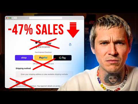
When customers arrive at the Shopify checkout, they are often greeted with express checkout options like Shop Pay, PayPal, or Google Pay. However, the presence of the word "or" can create confusion, especially for older customers who may think they are required to use one of those payment methods. This confusion leads to what is known as choice confusion, causing hesitation in the purchasing process.
To resolve this, you can edit the checkout language in Shopify. Change the wording from "or" to something clearer, such as "or continue with credit card." This small adjustment can eliminate hesitation and streamline the checkout experience.
Historically, Shopify checkout was divided into three steps: contact details, shipping, and payment. While this multi-step process may work for some older customer segments, research shows that one-page checkout is more effective for the majority of users.
From a psychological standpoint, a one-page checkout is perceived as a single action rather than a multi-step process, reducing mental effort and minimizing drop-off rates. To enable one-page checkout, navigate to Settings > Checkout > Customize, and switch to one-page layout.
Before entering payment details, customers often question the safety of their transaction. While most Shopify stores display a message stating that transactions are secure and encrypted, this may not be sufficient for all customers, particularly those who are less familiar with online shopping.
To alleviate anxiety, consider strengthening your security message. Instead of a generic statement, use something like "Secure encrypted checkout; your payment details are protected." This reassurance can significantly reduce friction at a critical moment in the purchasing process.
Many Shopify stores simply place their logo at the top of the checkout page, which can feel generic. Instead, consider using this space to display a banner or visual element that communicates trust and credibility. For example, you could showcase five-star reviews or a message indicating that your store is trusted by thousands of customers.
This type of social proof can lower perceived risk and make customers feel more comfortable completing their purchase. Additionally, you can use this space for sale reminders, such as "Big sale ends Sunday," to encourage customers to finalize their orders.
A common mistake in checkout design is overloading the page with colors and backgrounds, leading to visual noise. This can increase cognitive load, making it harder for customers to focus on completing their purchase.
To improve conversion rates, aim for a cleaner checkout design that minimizes distractions. A streamlined checkout allows customers to concentrate on one task: finishing their order.
Before customers even reach the checkout page, they may abandon their cart. If you notice a high rate of cart abandonment, it’s crucial to examine the cart experience itself. For instance, if a customer is interested in a portable espresso maker but there’s no urgency or incentive to complete the purchase, they may leave.
To combat this, consider adding urgency elements like countdown timers or free shipping progress bars. Additionally, suggest complementary upsells that help customers reach the free shipping threshold, such as coffee capsules or a travel case. This strategy makes additional items feel like small additions rather than separate purchases.
For higher-ticket items, presenting payment options can dramatically influence buying behavior. For example, a product priced at $600 may seem expensive, but if offered as $50 per month for 12 months, it appears more manageable.
If you have Shopify payments enabled, customers may see buy now, pay later options at checkout, such as Shopay installments. This flexibility can encourage customers to complete their purchases.
Once a customer completes their purchase, they have already made a decision, which means the psychological barrier is lowered. This is an ideal moment to present post-purchase offers. A simple one-click offer can add extra revenue without interrupting the initial purchase.
Consider offering additional products, warranties, or similar items that customers can add with just one click, increasing your average order value.
The thank you page is often overlooked, yet it is viewed by every customer who completes a purchase. This is a prime opportunity to communicate important information, such as order confirmation and delivery timeframes.
You can also include a bounce-back offer, like a discount code for the next purchase, or provide reassurance about tracking information. Additionally, remind customers to follow your social media channels to stay updated on future sales.
If your store offers subscriptions, ensure that customers can easily manage their subscriptions after checkout. They should be able to view upcoming orders, reschedule or skip deliveries, change quantities, and have options to pause or cancel their subscriptions.
This transparency can help reduce cancellations and improve customer retention.
Optimizing your Shopify checkout process is not just a technical task; it involves understanding customer psychology. By reducing confusion, minimizing friction, and increasing trust, you can make small adjustments that lead to significant improvements in conversion rates and average order values. Implement these strategies to enhance your checkout experience and drive more sales in your Shopify store.