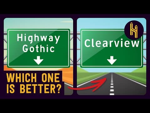
The U.S. has two official highway sign typefaces: Highway Gothic and Clear View. This post explores their origins, effectiveness, and the bureaucratic challenges surrounding their use, revealing a complex story of design, readability, and national politics.
If you've ever found yourself lost on the road, you might have noticed that road signs can guide you not just by their content but also by their typefaces. In the United States, two official typefaces dominate highway signage: Highway Gothic and Clear View. While they may appear similar at first glance, a decades-long debate has ensued over which is superior, a discussion intertwined with science, technology, and national politics.
The story begins in 1956 when President Dwight D. Eisenhower announced plans to expand the U.S. interstate system. With the construction of 41,000 miles of road, there was a pressing need for standardized signage. In the early days of American highways, road signs were not standardized and were often created by local auto clubs, resulting in a hodgepodge of hand-painted signs with varying letter styles.
When it came time to select a typeface for the new highway system, the choice fell on Highway Gothic. This typeface was a modified version of standard diecast letters, chosen more for its practicality than for any rigorous design process. Despite its lack of thoughtful design, Highway Gothic proved effective for many years, as it was readable from a distance and under various conditions. Its bold letter forms and wide spacing helped distinguish similar characters, making it a functional choice for road signage.
However, Highway Gothic was not without its flaws. One significant issue arose from its design, which was originally intended to accommodate a now-obsolete technology known as button copy. This involved placing reflective buttons along the letters of a sign to enhance nighttime visibility. A specific version of Highway Gothic, known as Series E Modified, was designed to be chunky enough to fit these buttons.
As technology evolved, button copy was largely replaced by retroreflective sheeting, which made entire signs reflective. Unfortunately, the thickness of Highway Gothic's letters, meant to accommodate the buttons, began to create readability issues at night. The interior spaces of letters like A, E, and O became too small, leading to a phenomenon known as the halo effect, where light blooms around the letters, making them difficult to distinguish.
By the 1990s, the shortcomings of Highway Gothic became increasingly apparent, particularly for older drivers who struggled to read the signs. In response, the Federal Highway Administration (FHWA) proposed increasing the size of the text on signs. However, this would require larger and more expensive signs.
Around this time, Donald Mer, a designer who had studied European road signage, introduced a new typeface called Clear View. This typeface retained the boldness of Highway Gothic but made crucial adjustments, such as expanding the interior spaces of lowercase letters and increasing the height of uppercase letters. Tests showed that Clear View improved readability by 16%, particularly at night.
Despite its advantages, the transition to Clear View was fraught with bureaucratic challenges. In 2004, the FHWA approved Clear View for optional use, allowing states to adopt it if they chose. Some states, like Texas, embraced it fully, while others, such as Florida, implemented it inconsistently.
States that wanted to use Clear View had to purchase it directly from Mer for $800, leading to improper usage in many cases. Misunderstandings about when to use uppercase letters, numerals, and proper spacing resulted in numerous signs that were technically illegal. The FHWA faced criticism for the confusion and inconsistency surrounding the new typeface.
In 2016, the FHWA decided to ban Clear View, citing that it was causing headaches and making signs look unattractive. This decision sparked significant backlash, leading Congress to intervene and force the FHWA to unban Clear View in 2018. The agency's stance became one of reluctant tolerance, stating that while they could not stop states from using Clear View, they did not endorse it either.
Today, the United States finds itself with two valid typefaces for highway signs: Highway Gothic and Clear View. The ongoing debate reflects not only a clash of design philosophies but also the complexities of government regulation and public safety. As the nation continues to navigate this typographic dilemma, the question remains: which typeface will ultimately prevail in the quest for clarity on the roads?