This article explores a unique visualization of global population changes over 12,100 years, resizing countries based on population density. It highlights historical population shifts, major events like the plague and colonization, and projects future trends according to UN estimates, showing significant growth in Africa and population decline in countries like China by the end of the century.
Understanding how the world's population has changed over millennia offers fascinating insights into human history, migration, and development. A unique visualization technique resizes countries based on their population, providing a fresh perspective on demographic shifts from 12,100 years ago to projections into the future.
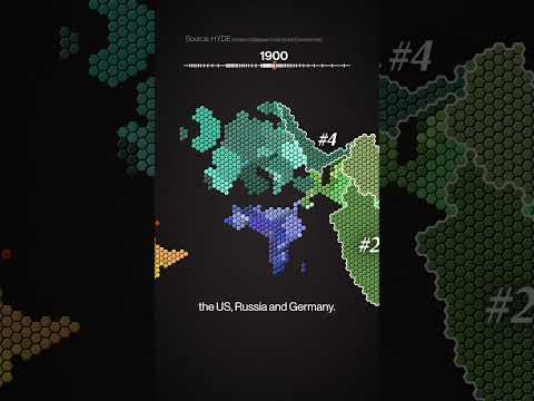
The visualization begins with a standard world map, but instead of representing countries by their geographic size, each country is given one hexagon for every million people it contains. This means countries with lower population densities shrink, while those with higher densities expand. Countries and territories with fewer than 500,000 people are excluded from the map.
This approach is based on population estimates from the United Nations (UN). Preserving the shapes and relative positions of countries while resizing them according to population was a challenging task. For example, Italy had to be inflated, Russia was significantly shrunk, and India barely fits on the map due to its massive population.
The final product offers a compelling visual representation of how population density reshapes our perception of the world.
The visualization is not limited to the present day. It includes a series of maps that extend 80 years into the future and deep into the past, using estimates from the History Database of the Global Environment.
By the start of the Common Era, about two-thirds of the global population lived in Asia. The regions now known as India and China were already major population centers, highlighting their long-standing demographic significance.
Examining the population by current country borders (despite historical border changes) reveals the largest populations were in China, India, the United States, Russia, and Germany.
The 20th century saw explosive population growth, culminating in the present day (2020) where the population distribution map reflects these dramatic changes.
The visualization also includes the UN’s medium projection for the future, which is one possible scenario among many. This projection suggests:
The future of global population is a topic of debate. Some argue for encouraging higher birth rates, while others advocate for fewer births. This discussion reflects broader concerns about sustainability, economic development, and social structures.
For those interested, still images and a horizontal version of the visualization, which some find more visually appealing, are available on Patreon.
This visualization offers a powerful way to understand how human populations have shifted over thousands of years and how they might change in the future. It challenges our traditional geographic perspectives and highlights the dynamic nature of human settlement and growth across the globe.