This blog post delves into the concept of color as an emotional vessel in design, particularly in the context of steam deco punk. It examines how chosen hues can embody kindness, connection, and courage, transforming digital art into emotional architecture that resonates with viewers.
In the realm of design, color plays a pivotal role, not just as a visual element but as a profound emotional communicator. The concept of color transcends mere aesthetics; it embodies feelings, memories, and connections. This exploration begins with a thought-provoking question: What if kindness had a hue? This inquiry sets the stage for a deeper understanding of how colors can influence our emotions and perceptions.
When we consider the emotional implications of color, we must ask ourselves how different hues can represent various feelings. Would kindness manifest as a radiant, vibrant color, or would it be more subdued and quiet? This question invites us to reflect on our personal associations with color and how they shape our experiences.
In this context, saturation is not merely a technical aspect of color but a representation of emotional presence. Saturation refers to the intensity of a color, and in design, it can convey a spectrum of emotions. The chosen hues become vessels for generosity, connection, and courage, allowing designers to communicate complex feelings through their work.
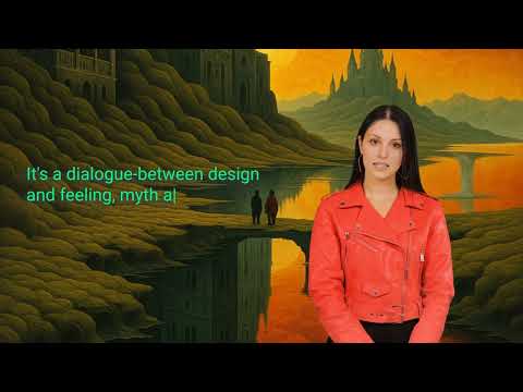
In the niche of steam deco punk, color is never random. It serves as a dialogue between design and feeling, intertwining myth and memory. Each tone selected in this genre is intentional, contributing to a larger narrative that resonates with viewers on an emotional level.
Colors in steam deco punk do not shout for attention; instead, they engage in a subtle conversation. They linger long enough to be heard, allowing viewers to absorb their significance. This approach transforms color from a mere visual element into a powerful tool for storytelling and emotional connection.
The creation of digital art in this context is akin to constructing emotional architecture. Each pixel is placed with care, contributing to a larger emotional landscape. This meticulous attention to detail ensures that the final piece is not just visually appealing but also resonates deeply with its audience.
The healing aspect of color cannot be overlooked. In a world where digital interactions are increasingly prevalent, the emotional architecture built through color can provide solace and connection. The colors chosen in this artistic expression have the potential to heal, offering viewers a sense of comfort and understanding.
The covenant of color invites us to reconsider our relationship with hues in design. By viewing color as an emotional vessel, we can appreciate its power to convey kindness, connection, and courage. In the world of steam deco punk, color becomes a dialogue that speaks to our hearts, transforming digital art into a meaningful experience. As we continue to explore the emotional depth of color, we unlock new possibilities for connection and understanding in our increasingly digital lives.